Your Free Gift The Basic Bundle for Fashion Designers
Your Free Gift The Basic Bundle for Fashion Designers

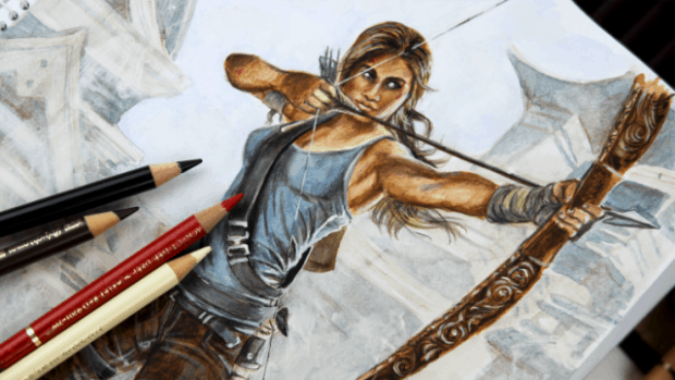
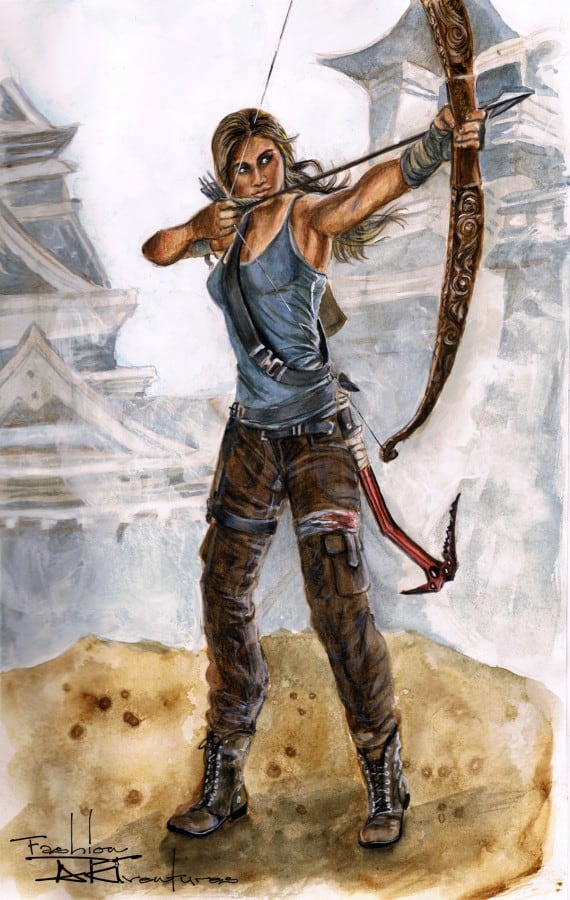
Today’s tutorial is inspired by Lara Croft Tomb Raider. This fashion illustration is more time-consuming and require a higher skill level. The complicated part of this drawing is the fact that the direction of light coming from behind the figure is changing the shadows and highlights dramatically.
https://www.youtube.com/watch?v=5Z1FCkLlyus
If you want to have a background in your fashion sketch or illustration, I’d advise you to begin with it first. This way even if the colors run over the figure or the fabrics, you can still correct or cover up any marks.
For the basic skin tone of Lara Croft, I mixed burnt sienna with a little bit cadmium red. Pay attention that the source of light is at the right-hand side behind the figure. The light reflections will be visible at the figure’s back, her left cheek and the back of her arms. Her right cheek, arm, and chest will be in shadow.
To render this drawing I used artist grade watercolors. If you are following my tutorials you already know that I work by grading colors. I use two brushes for this technique one brush is loaded with color; the second one is clean and used to blend out the colors. Once the surface was dry I used color pencils to add more details and shades in certain areas. The more layers you apply the vibrant colors you’ll get.
I used a golden brown as a base for the hair. Start with the lightest color and use a darker pencil to add shadows until you get the perfect shade of the hair. Remember not to cover the areas where the light creates reflections on the hair. If you added too much darkness you can use a kneaded eraser to pick up some of the pigment and lighten up the areas or use an opaque bright color to add reflections as I did in this case. I used that same opaque white color to add the highlights on the figure’s skin, top, pants, and weapons.

For the clothing, I picked out blue, grey and brown shades. As you’ll notice I repeatedly use them in every single clothing piece but every color appears in different amounts; For instance, the midtone for the top is blue but I mixed grey and brown in the shadows. The pants are actually brown but I used a bright blue pencil for the highlights and grey or black for the shadows. This is one way to keep the colors balanced or harmonious and avoid overpowering the drawing by using too many different colors.
To make the string of the bow you need well sharpened black and white pencils or a milky gel pen. As you draw the line switch the pencils from black to white and repeat the process. The best effect is achieved by drawing the line using the white milky gel pen over darker areas and the black pencil over light colors. When you draw the shoes you can add a little bit more shine to the leather.
As always, thank you so much for reading, watching and sharing so generously.
if you liked this post, you'll PROBABLY be into these—
Business tools, art materials, equipment
You wanna see my secret weapons for running my biz and creating art? Here is a sneak peek at what’s happening behind-the- scenes at Fashion ARTventures.
This is everything I have used and loved, from my art techniques and software, to my filming equipment and platforms that help me run my biz !


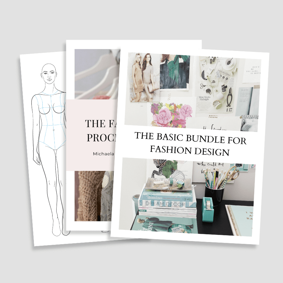
THE BASIC BUNDLE is a collection of female fashion templates in the most essential poses + the fashion design process checklist and the fashion figure proportion scale for sketching the croquis freehand.
Grab your favorite paints or your iPad, put on some chill tunes, find a cozy spot, and let us take you on a journey full of ARTventures! As you color, you’ll be practicing your artistic skills, exploring color combinations, and improving your eye for design.